Frigidaire - Packaging Design

Overview
Refrigerator water filters are a routine but essential purchase. One that should be simple, yet often isn’t. I worked on redesigning the packaging system to make filter identification and replacement more intuitive, reducing friction at the point of purchase and improving the overall customer experience.
Challenge
The existing packaging created confusion at the exact moment clarity mattered most.
In-store observations revealed the problem: opened boxes, misplaced products, and shoppers trying to decode which filter they actually needed. The system was working against them.
Key issues included:
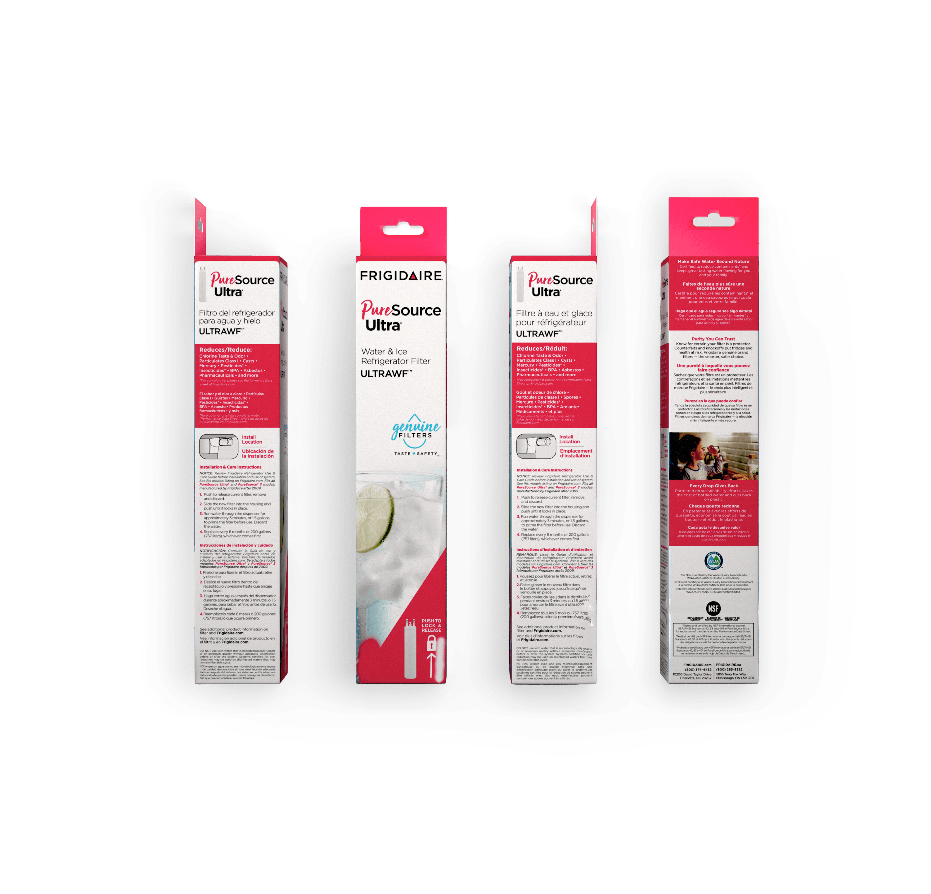
- Nearly identical front panels across different filter models
- Multiple model identifiers competing for attention
- Low visual differentiation between products on shelf
The result was uncertainty, turning a simple replacement into a frustrating decision.
Approach
The redesign focused on a single principle: make the right choice obvious.
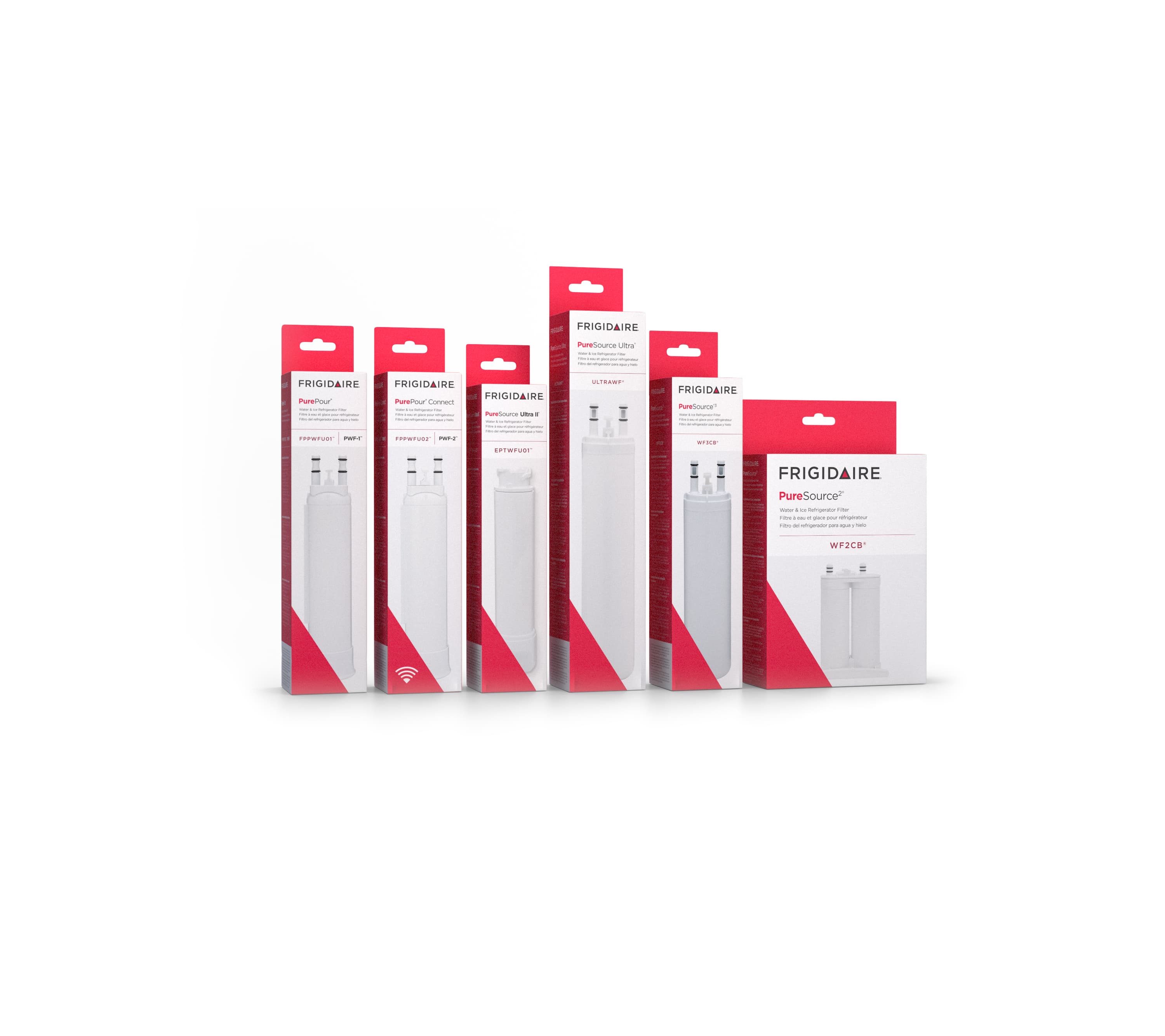
Rebuilt the front-of-pack hierarchy to clearly prioritize the filter model
- Introduced large, prominent product imagery to create immediate visual differentiation
- Simplified and reduced competing information to eliminate cognitive overload
- Designed the system to align with how shoppers actually navigate the aisle, not how the product was previously categorized internally
Every decision was grounded in reducing friction—so the customer could identify, trust, and purchase the correct filter without second-guessing.
Outcome
The updated packaging transformed a confusing shelf experience into a clear and intuitive one. Shoppers could quickly identify the correct filter, reducing the need to open boxes or cross-check manuals.
By aligning the design with real customer behavior, the system improved both usability and confidence.

